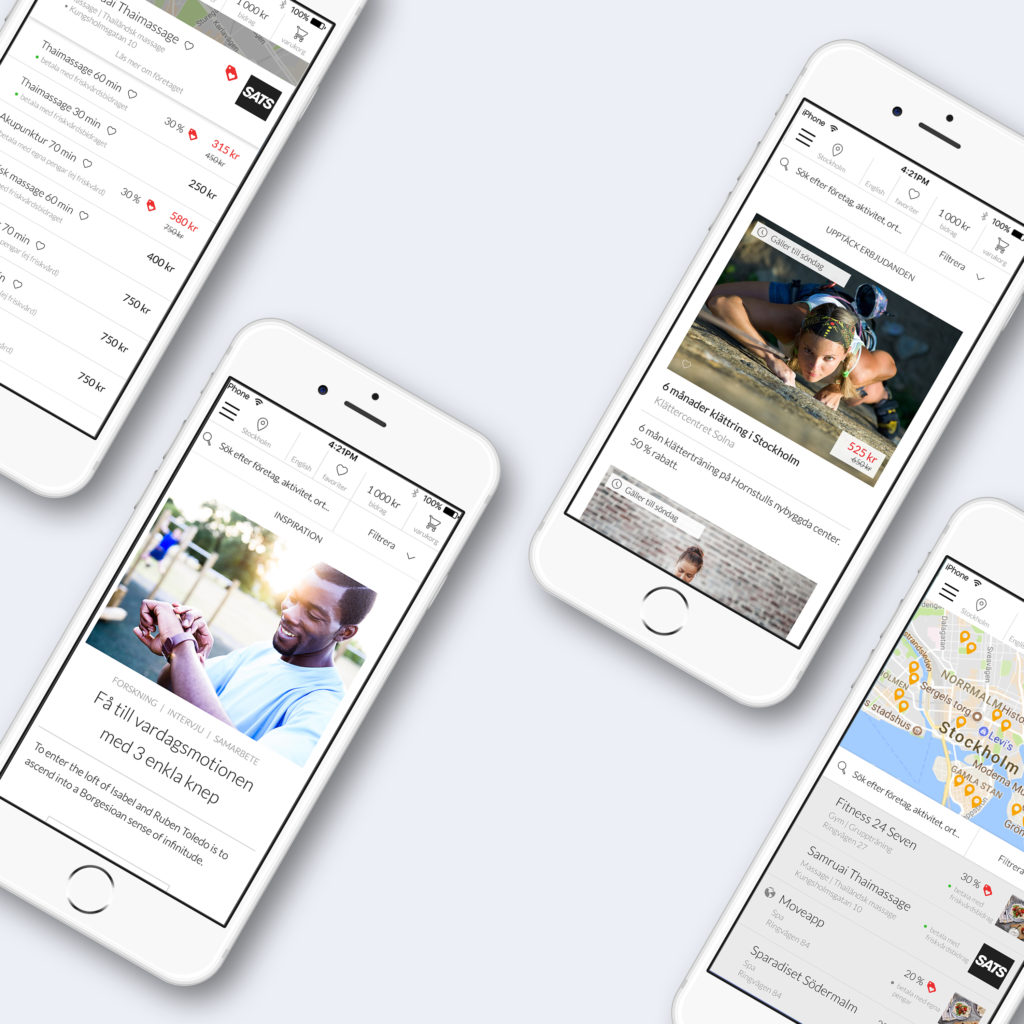
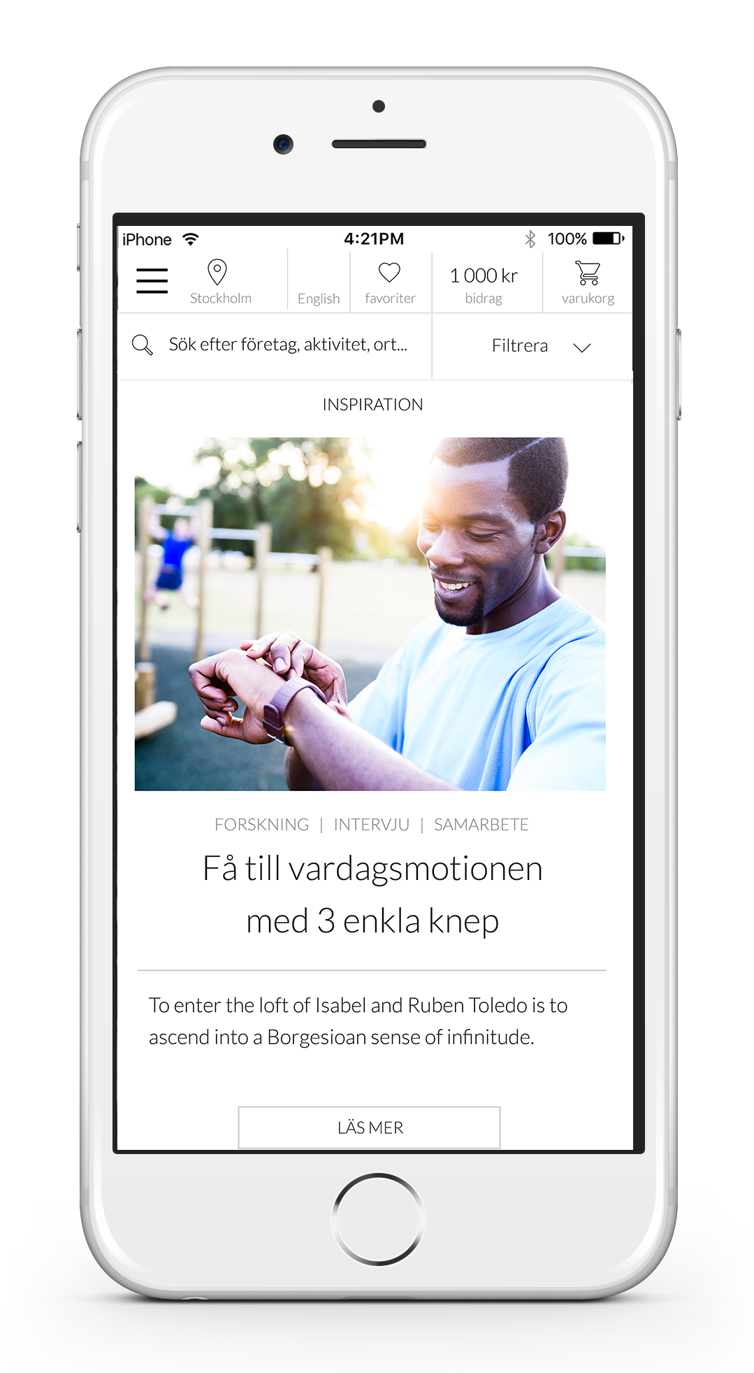
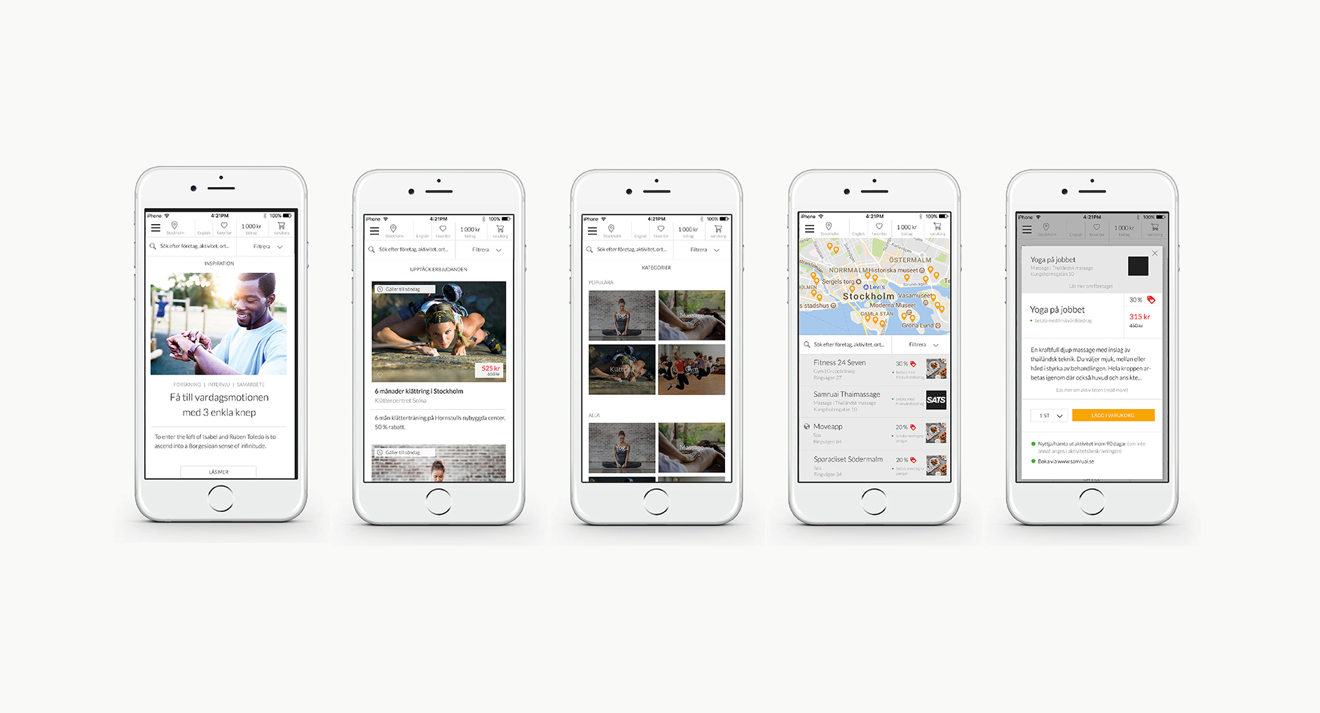
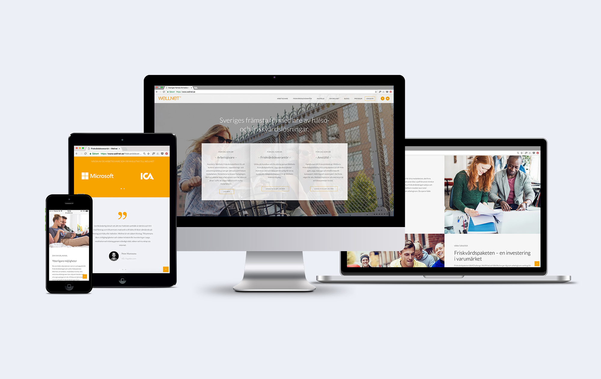


Rebranding of Wellnet's visual identity, web page and UI and UX design for their customer and supplier platforms (SaaS platforms).
Wellnet deliver healthcare benefit services to organisations and companies that take the health and sustainability of their employees seriously.
The rebranding of Wellnet was about inspiring to a healthy lifestyle for both those already active and most importantly those who don't yet identify as active people. We wanted to welcome those who find it intimidating or daunting to get on top of their health with Wellnet.
We used soft, light imagery exploring what feeling people radiate when they obtain a healthy lifestyle, rather than only showing sweaty, fit people in action whom only a small portion of the users would identify with. The imagery reflect the radiant feeling of the results of preventive health care.
The imagery was combined with a light Scandinavian inspired look since Wellnet is the only company in the market who has its roots, and is fully focused, on the Swedish market. This is a differentiate them from the competitors. The warm yellow is full of energy and is used as a accentuation to bring warmth to the visual expression. Visit site at www.wellnet.se.
© Nor Studio 2021